An iconographic and text archive related to communication, technology and art.
☛ Arts and Architecture, “How to Look. A sixth and a summation of a series on modern art”, Ad Reinhardt, January 1947, pp. 20-27.
In this 1947 issue of Arts and Architecture, six instalments of the satirical cartoons series “How to Look” by American artist Ad Reinhardt (1913-1967) are reproduced: “How to Look” (p. 22), “How to Look at Space (p. 23), “Hey, Look at The Fact” (p. 24), “How to Look at Things Through a Wine-Glass” (p. 25), “How to Look at More than Meets the Eye” (p. 26), and “How to Look at an Artist” (p. 27). Those were originally part of a larger collection first published in the daily newspaper PM during the previous year (1946). A catalogue produced in 1980 by the Whitney Museum of American Art about the works of Reinhardt in its permanent collection provides a better understanding of the story behind those drawings:
From the late 1930s through the early 1940s, Reinhardt had supported himself by assisting industrial designers (among others, Russell Wright) and as an illustrator (his controversial drawing of a figure with a visible navel made for Ruth Benedict’s Races of Mankind, helped resolve this now-dated issue). This training and experience were put to service in his first cartoon-illustration, produced for PM, a short-lived, leftist-oriented, New York afternoon newspaper. For a little under a year, beginning in late January 1946, one of Reinhardt’s cartoons appeared every few weeks in PM’s Sunday magazine section. They were information-filled parodies on the “How to” series: “How to Look at an Artist,” “How to Look at Space,” How to look at Things through a Wine-Glass,” “How to Look at More than Meets the Eye,” and eighteen other multi-image and text sheets. The general purpose of the series was to satirize “Bauhaus, surrealist and expressionist pretentions to meaning.” (Art as Art, Viking Press, 1975, p. 15). The final cartoon in the PM group, “How to Look at a Spiral,” never ran. The management seems to have realized that Reinhardt was mocking them too; he was fired. How to Look at a Spiral and A Page of Jokes, a grab bag of humor in the vein of the “How to” series, survive and are in the Museum’s collection only because they never go to press; the other PM cartoons exist as photo reproduction from surviving copies of the news paper. (Ad Reinhardt, a concentration of works from the permanent collection of the Whitney Museum of American Art., Whitney Museum of American Art, 1980, p. 21)

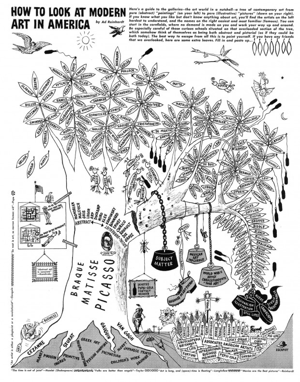
Some cartoons were reproduced in various publication over the years, sometimes with updates by the artist. For example “How To Look At Modern Art In America” ran in ARTNews in 1961, for the fifteen anniversary of the first publication (copies are available at the Smithsonian Archive of America Art website).
In 1975, a selection of 23 cartoons from the original series was assembled in a booklet annotated by the critic Thomas Hess: The Art Comics and Satires of Ad Reinhardt (Kunsthalle Düsseldorf, Marlborough Roma, 1975). In a piece he wrote for The New York Times in 2003, art critic Richard B. Woodward borrows from Hess notes in order to provide Ad Reinhardt’s cartoons with additional historical context, and explains how the series was extended after 1946:
The critic Thomas Hess wrote in a booklet for the 1975 edition that Reinhardt’s lampoons are ’’like precious containers of the air of New York, 1946-61.’’ They are also like core samples from the artist’s brain, revealing a side of his personality not apparent in his canvases. Using cutouts from 19th-century illustrated books and periodicals, as well as line drawings and hand-drawn dialogue balloons, he concocted a style in which the surrealism of J. J. Grandville and Max Ernst was inflected with a tough Queens accent. As jabbering, pugilistic and outright funny as his abstract paintings are serene and self-contained, the cartoons can be enjoyed both as pointed social commentary and as autobiography.
You need Hess’s annotations to get all the inside jokes, references to galleries long gone and to critics and artists obscured by history. But in the work for PM, Reinhardt was asked to explain the principles of the art he practiced to a mass audience. This was a time, just after World War II, when New York’s art institutions were truly conservative and not pushovers for the latest trends. Reinhardt has a fine time deriding museums, critics and a public that believed everything in a picture had to stand for something real. One of his recurring panels shows a stick figure pointing at a canvas of crisscrossed lines and asking, ’’What does this represent?’’ The indignant painting, having grown eyes, a mouth, arms and legs, punches him in the jaw and answers with an even more aggressively New York question, ’’What do you represent?’’
By the 50’s, Reinhardt’s colleagues were better established, and so he trained his guns on outposts that supported them, including the Museum of Modern Art. In his ’’Museum Racing Form,’’ a 12-panel work that he did in 1951 for the short-lived magazine ’’Trans/formation,’’ he handicaps the artists for the coming season and pairs them with their advocates. Clement Greenberg, James Johnson Sweeney and Alfred Barr pick Jackson Pollock, while Hess has his money on Willem de Kooning. He fills a final panel, ’’From the Horse’s Mouth,’’ with a series of dialogue balloons. (The New York Times: “Ad Reinhardt, Newspaper Cartoonist: The Abstract Double Agent”, Dec. 21, 2013)

The most complete collection of Reinhardt’s cartoons was only produced recently. To mark the 100th anniversary of Reinhard’s birth, an exhibition was held at the David Zwirmer art gallery, in New York, from November 7 to December 18, 2013 (read a review of the exhibition at The New York Times: “An Abstractionism Shaped by Wounded Ideals” by Hollad Cotter, Nov. 21, 2013). For the occasion, David Zwirmer published Ad Reinhardt: How to Look: Art Comics, a comprehensive catalogue of Reinhardt’s cartoon work. The catalogue includes essays by the curator of the exhibition, Robert Storr.
The gallery additionaly produced a video of curator Robert Storr giving a guided tour of the exhibition. The 30-min video titled “Curator Robert Storr on Ad Reinhardt at David Zwirner, New York” was recorded on November 9, 2013. It is embedded below as well (the artist Chuck Close is present in the crowd).
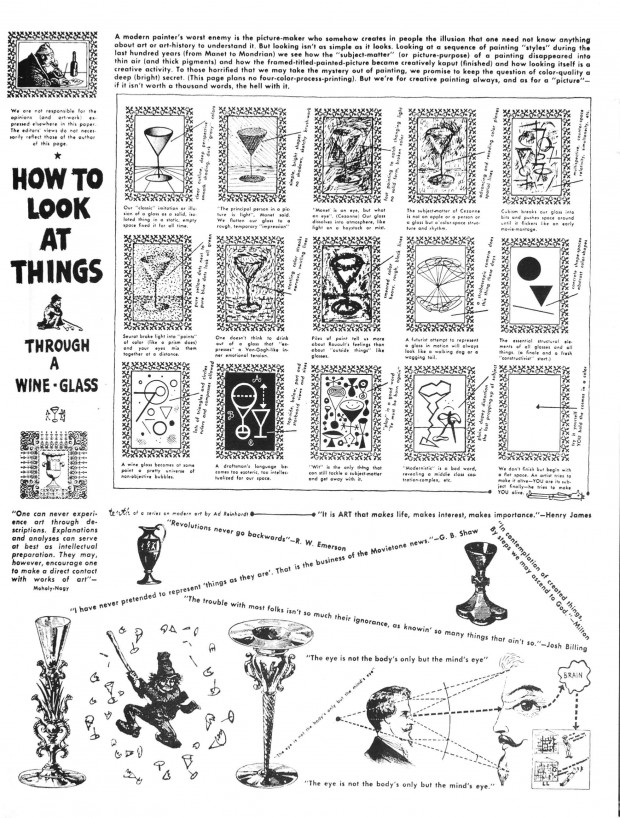
[UPDATE–August 8, 2014]. At his blog 10 O’Clock Dot, Max Tohline pointed out how Reinhard’s cartoon “How to Look at Things through a Wine-Glass” (from July 7, 1946) was redesigned by Edward R. Tufte as part of his book Visual Explanations (1997). Here’s how Tufte describes his approach towards Reinhard’s work:
Multiples organize their images by means of a variety of devices: grids, compartments, call-outs, narrative sequence, overlap (opaque or transparent), and integration of multiple elments into a common field. Such organizational apparatus should be visually minimal; better to use the space for information. Ad Reinhardt’s multiple above [“How to Look at Things through a Wine-Glass”], a witty introductory tour of modern artists, compares 12 versions of a wine glass. Each intriguing and smartly annotated image is surrounded by a noisy border, administrative bloat that consumes an astonishing 42% of space in each framed rectangle. It resemble all too many computer displays, where a cramped window showing the user’s work is framed by a bureaucratic debris of scroll bars, buttons, titles, icons, and over-produced drawings. Above, my redesign strips away all the frame (for the edge of each picture defines itself well enough) and also adds each artist’s typical palette of colors to the original stylized sketches.
In a paragraph accompanying his illustrated history of 20th-century art, Ad Reinhardt wrote what is probably the single best sentence ever written about the point of images for information design: “As for a picture, if it isn’t worth a thousand words, the hell with it.” (Cheshire: Graphics Press, 1997, pp. 118-119)

- By Philippe Theophanidis
- on
- ― Published in Art, Communication
- Tagged: cartoon, institution, modernism, Reinhardt, satire

