An iconographic and text archive related to communication, technology and art.
The Greeks gave us logic. We owe them for that. It was Aristotle who came up with the big ‘therefore’. As in, ‘You don’t love me any more, therefore . . . ‘ Or, ‘I found you in bed with another man, therefore . . . ‘ We use this word millions of times, to make our most important decisions. It’s about time we started paying for it.
If every time we use the word therefore, we have to pay 10 euros to Greece, the crisis will be over in one day, and the Greeks will not have to sell the Parthenon to the Germans. We have the technology to track down all those therefores on Google. We can even bill people by iPhone. Every time Angela Merkel tells the Greeks we lent you all this money, therefore you must pay us back with interest, she must therefore first pay them their royalties.
☛ The Guardian.co.uk: “Jean-Luc Godard: ‘Film is over. What to do?'” Jean-Luc Godard (quoted above) interviewed by Fiachra Gibbons, July 12, 2011
Of course JLG’s joking:
He laughs, I laugh, someone listening in the next room laughs. Godard is, of course, against the whole bourgeois capitalist concept of copyright: he gives it the finger in a none-too-subtle gag at the end of Film Socialisme, the latest salvo in his 40-year war against Hollywood, released last week. Cinema’s enfant terrible may be 80, but he’s lost none of his genius for contrarian cheek.
The whole interview is about the release of his latest film Film Socialisme. The official website (filmsocialisme.com) for the film has been in “maintenance mode” for the last couple of days. One can download the official press kit from the Festival de Cannes website (French / English).
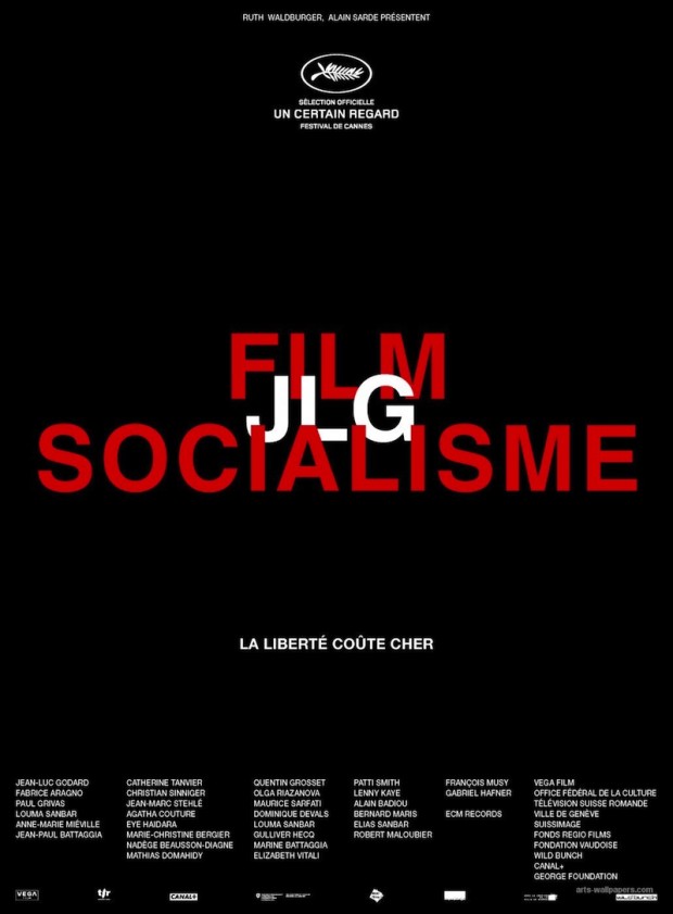
Below is one of the official poster. The design of the title intertwined with Godard’s initial should feel familiar. Godard’s use of typography (often red, white and blue) is pretty consistent in his filmmaking throughout his career and acts like a signature. Along with the poster, one will found more online resources about the ways typography is used in many of his films.
- Walker Art Center’s blog: “Godard’s Intertitles” by Andrea Hyde November 10, 2009:
Godard inserts text and image into a variety of contexts, including, but not limited to: handwritten letters, neon signs, shop signage, book and magazine covers, collages, grafitti, posters, cinema marquees, corporate logos, the pages of comic books, advertisements, newspapers, children’s books and political pamphlets. Pierrot le fou (above) is rich with contextualized text. Its narrative is reinforced by the images of handwritten letters between protagonists, signs from the places they travel, and a book called, “La bande des pied nickelés,” a cartoon about a group of ne’re-do-wells who make their living scamming the bourgeois. Cropped and blinking neon signs highlight specific words, or segments thereof (e.g. “Riviera” becomes “vie), a mercurial device well-suited to Pierrot le fou. Overall, the embedded texts add meaning and beauty to the film, with patterns of live action and still text reminiscent of a graphic novel. There are few purely typographic titles in this film, but all have dotted upper case “I”s and capital letters centered on black backgrounds—the default Godardian style—set in Antique Olive, a face newly developed in the early ’60s by Fonderie Olive.

- Atelier Carvalho Bernau: “Jean-Luc Typeface”, December 3, 2010. The nice folks at Atelier Carvalho Bernau designed a typeface to celebrate the eighty-eight birthday of Godard. Even better: the typeface can be downloaded for free. As for the inspiration:
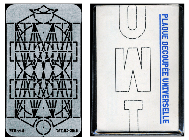
We can not prove this at all, but we think it may be derived from the stencil letters of the Plaque Découpée Universelle, a lettering device invented in the 1870s by a certain Joseph A. David, and first seen in France at the 1878 Exposition Universelle, where it found broad appeal and rapid adoption. We think this style of lettering was absorbed into the public domain vernacular of French lettering, and that the 2 ou 3 choses titles are derived from these quotidien lettering style, as it would seem to fit Godard’s obsession with vernacular typography.
The Plaque Découpée Universelle is a fascinating apparatus: a single piece of stencil with which one can draw all letters and numbers. Learn more at Dries Wiewauters.

- The Movie Title Stills Collection: “The Typography of Jean-Luc Godard” by Christian Annyas, December 16, 2010:
I’ve located almost all films from the earlier part of Godard’s career and took all stills containing typography: titles from the opening title sequences, intertitles and end (“Fin”) titles. Like silent films Godard used lots of intertitles, which make his films much more typographic than other films from the ’60s and 70′s.

- By Philippe Theophanidis
- on
- ― Published in Art, Design, Movies
- Tagged: design, Godard, humor, still, typography

