An iconographic and text archive related to communication, technology and art.
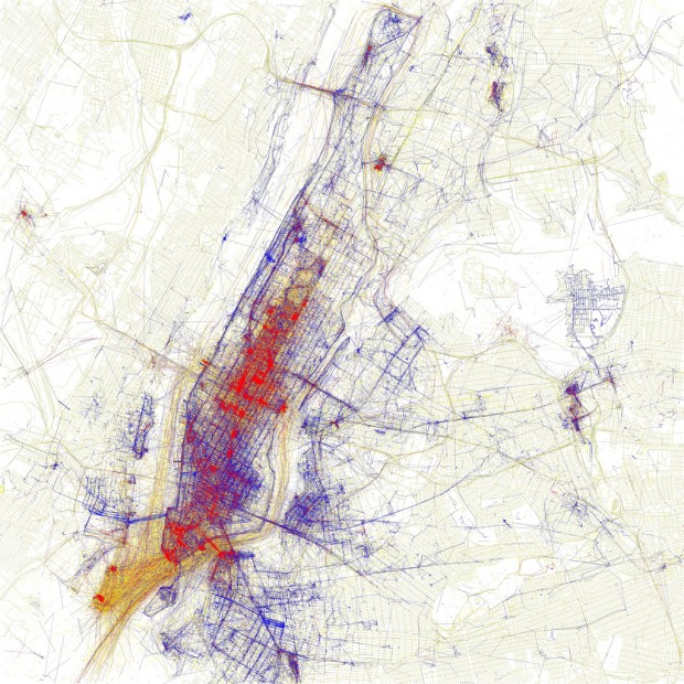
☛ Eric Fischer photostream on Flickr: “North American detail map of Flickr and Twitter locations” from the See something or say something series, by Eric Fischer, uploaded July 7, 2011 (some right reserved: CC BY 2.0)
Digital cartographer Eric Fischer created color-coded maps depicting users of both Flickr and Twitter. He did so by gathering geotagged photos uploaded to Flickr and geotagged tweets posted on Twitter. He was able to gather this data using Flickr’s search API and Twitter’s streaming API:
Red dots are locations of Flickr pictures. Blue dots are locations of Twitter tweets. White dots are locations that have been posted to both
In the summer of 2010, Eric Fischer created a set of 135 maps of major cities around the world depicting the localization of tourists vs. locals (based on Flickr’s geotagged photos):
Blue points on the map are pictures taken by locals (people who have taken pictures in this city dated over a range of a month or more). Red points are pictures taken by tourists (people who seem to be a local of a different city and who took pictures in this city for less than a month)

In the spring of 2011, he uploaded a set of 109 maps depicting “racial and ethnic divisions in US” based on the 2010 Census:
Red is White, Blue is Black, Green is Asian, Orange is Hispanic, Yellow is Other, and each dot is 25 residents.

More resources online about Eric Fischer’s work:
- He’s on Flickr and Twitter where his info reads:
Geek of maps, failed transportation plans of the past, history of technology, computers, pedestrianism, and misspelled street signs.
- San Fransisco Chronicle: “Digital cartographer Eric Fischer maps race, crime” an interview with Will Kane, December 19, 2010. Excerpt:
The main thing about it is that when you get people’s behavior in the aggregate, you can get patterns that don’t show up in any single individual’s experience in the world.
- Mission Loc@l: “The World According to Fischer” an in-depth profile by Christine Mai-Duc, November 29, 2010. Excerpt:
The 37-year-old, who works for a technology company, has become increasingly well-known for his hobby as a creator of maps and curator of illuminating, often quirky, bits of transit history. Fischer’s maps have been called art. People who see them on Flickr comment on their beauty, marvel at their intricacy. Many ask for prints to decorate their walls.
- By Philippe Theophanidis
- on
- ― Published in Art, Communication, Technology
- Tagged: Flickr, geography, map, space, Twitter

