An iconographic and text archive related to communication, technology and art.
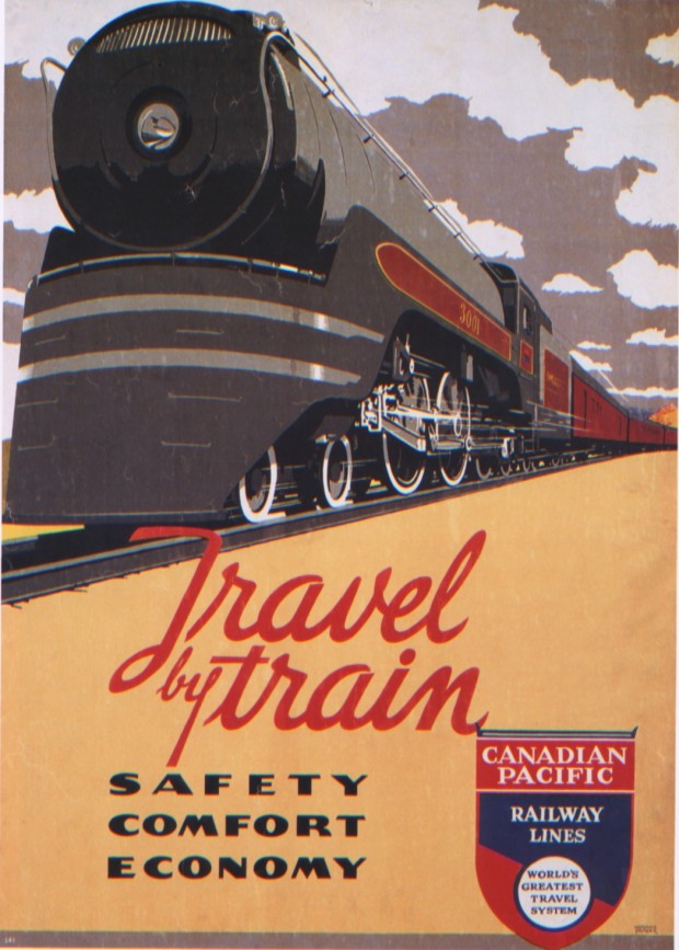
☛ Posters of the Canadian Pacific by Marc H. Choko and David L. Jones, Richmond Hill: Firefly Books, 2004, p. 126. The poster depicted above was created by Norman Fraser in 1937 (60 x 90 cm, CP silkscreen No. 343. A6365).
Marc H. Choko is the Director of Design at the University of Quebec at Montreal. David L. Jones is an archivist with the Canadian Pacific Company and the author of Tales of the CPR.
This is truly a magnificent book, especially for those interested in deco-style lithographic and silkscreening posters, similar for example to those produced in the United-States by the Works Progress Administration (WPA: I collected some example here). New as well as used copies of the book are easily found online (see Amazon and AbeBooks).
Here’s a general presentation of the book (from the book’s front flap):
At its height, the Canadian Pacific Railway was hailed as the world’s greatest travel system. Its transcontinental railway spanned North America from the Atlantic to the Pacific, while the company also operated luxury hotels and resorts, passenger ocean liners, cargo ships and airplanes.
To promote itself ―and Canada― to the world, Canadian Pacific produced more than 2,500 stunning lithographic and silkscreen posters. They were displayed in offices and independant travel agencies worldwide, from the 1880s until the 1970s.
The posters represented what both Canadian Pacific and Canada had to offer: a world of deco-style streamlined locomotive, luxury resorts and wilderness surroundings, glimpse of distant romance and adventure, ocean liners sailing to faraway locations, magnificient hotels, and the dawning of the jet age. These posters enticed millions to visit and even settle in Canada.
The book offers a sampling of 300 of those posters, in color, and with detailed source attribution (name of the artist, date of creation, medium used, dimensions, etc.). Furthermore, a good deal of explanations about the social and historical context of production of those posters are provided all along the book, allowing the reader to appreciate those illustrations not just for their aesthetic value but also for the function they were meant fulfill.
Here’s how the authors present the poster depicted above. The advantages and constraints of using silkscreens are discussed, as well as the historical development of the Canadian Pacific during the 20s and 30s:
During the 1920s, a small number of Canadian Pacific posters originated from Canada. Although the quality of the lithography is good, nothing is known about the artists or the printers. The most important phase of posyer production in Canada did not begin until 1932, when a silkscreen printing shop was established in the company’s Windsor Station headquarters in Montreal. […]
The decision to use serigraphy, or silkscreening, for the majority of posters produced during and after the 1930s was based on practical considerations. As the May 1938 issue of Canadian Transportation reported, “The business recession of the early 1930s was the direct reason for the Exhibit Branch entering the field of reproduction.” Silkscreening required a significant amount of hand work, which was not a problem during the Depression. The technique did require any expensive or sophisticated equipment. It was a fast process from conception fo the design to final production (preparation was minimal), and modifications to deisgn or text were easily introduced at any stage of the process with little extra cost. […] (p. 113)
Meanwhile:
A new style of rail service was developed in the 1920s. The Trans-Canada Limited train offered a virtual land cruise across the country. Rather than providing a long trip in coach seats, the “limited” status of this service ensured that all were well ensconced in sleeping cars, with rolling amenities that included lounge, dining and observation cars. Publicists called it the “Fastest Train on the Continent”. Typically, Trans-Canada Limited posters featured diminutive red CPR trains in dramatically lit alpine settings, accentuating the majesty of the CPR’s route through what the company liked to call “the Canadian Pacific Rockies.”
“Safety, Comfort, and Economy” were, as the ad said, the benefits of “Travel by Train.” And “for Greater Comfort,” read one sign, “when travelling at night, take a section―upper and lower berth―at a very nominal charge.” […] (p. 121)
• • •
Previously: see “La Péninsule De Gaspé Peninsula” a lithograph poster of similar style to those produced by the Canadian Pacific.
- By Philippe Theophanidis
- on
- ― Published in Art, Communication, Silkscreen, Technology
- Tagged: advertising, Canada, Candian Pacific, poster, railway, tourism, train, travel, vacation

